
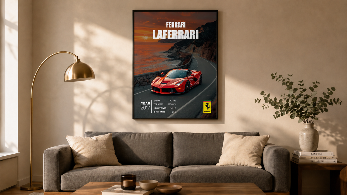
Most car art ends up exactly where it shouldn't — taped above a desk in a teenage bedroom, or rolled up in a tube somewhere in the garage. That's a shame, because a well-framed car poster is one of the few pieces of wall art that telegraphs personality without saying a word — and it belongs in your most-used room: the living room.
The problem isn't the cars. The problem is the framing, the size, and the placement. Get those three things right and a Ferrari poster reads as sophisticated collector. Get them wrong and it reads as I forgot to grow up.
This guide shows you exactly how to do it right, with two examples we styled in real interiors using two of our most-shipped supercar prints.
The Statement Piece: Anchoring Above the Sofa

The sofa is the centre of gravity in most living rooms. Anything you hang above it becomes the room's headline. A single, large, properly framed poster — like our Ferrari LaFerrari (2017) in the photo above — does the heavy lifting on its own. No gallery wall needed.
Three rules for above-the-sofa placement:
- Size proportional to the sofa. The framed poster should span roughly two-thirds the width of the sofa beneath it. For a standard 3-seater (around 210 cm wide), that means our 50 × 70 cm size is the right call. Smaller and it floats awkwardly; larger and it dominates.
- Hang at eye level. The centre of the artwork sits roughly 155–160 cm from the floor. People look at art, not ceilings.
- Leave breathing room. Bottom edge of the frame should be around 20 cm above the top of the sofa back — close enough to feel intentional, far enough to feel framed.
The frame matters as much as the print. A thin matte black-stained oak moulding (the default on every poster we ship) reads as gallery-grade. A glossy plastic frame from a bargain online seller — even with the same artwork inside — reads as student dorm. Browse the full Automotive Icons collection →
The Conversation Starter: A Reading Nook or Study Corner

Not every car poster wants to be above the sofa. Some are better as the focal point of a smaller, more intimate corner — a reading chair, a vinyl listening spot, a personal study. The McLaren P1 (2013) above is hung in a mid-century modern study with a tan Eames lounge chair and a vinyl record player. It reads as a personal trophy in a personal space — not a statement to your dinner-party guests.
For these settings, drop down one size — 40 × 50 cm is the sweet spot. Big enough to anchor the corner, small enough not to compete with the chair or the lamp.
Style matching:
- Mid-century modern rooms love saturated walls (moss green, oxblood, deep navy). A black-framed minimalist car poster on a deep colour wall has the same energy as a piece in a curated gallery.
- Scandinavian / warm minimal rooms work best with a warm-neutral wall (beige, oat, soft taupe). The frame stays black, the mat stays wide and white.
- Industrial / loft rooms can take exposed-brick or concrete backdrops. The frame can shift to a thicker, slightly distressed black moulding — still hand-framed, just visually heavier.
How to Pick the Right Size for Your Wall
We ship every poster in three sizes. Use this quick decision tree:
| Size | Best for | Wall context |
|---|---|---|
| 30 × 40 cm | Hallways, small rooms, paired sets | Above a console table or in a tight gallery wall of 4–6 frames |
| 40 × 50 cm | Reading corners, studies, bedside walls | Single piece above a chair, credenza, or smaller furniture |
| 50 × 70 cm | Living room hero, dining room statement | Centred above a 3-seater sofa, dining sideboard, or king bed |
Framed vs unframed? Always framed if you can — our default frame is high-density MDF stained matte black, with shatterproof anti-reflective plexiglass and a wide white acid-free mat. It's hand-assembled in our EU studio, ready to hang straight out of the box. Unframed posters work if you have an existing frame collection you want to fit into, but most customers regret the cheap aftermarket frame they buy to save €7.
Three Common Mistakes to Avoid
- Hanging too high. The most common mistake. Art lives at eye level, not at ceiling level. A poster sitting 30 cm above where it should be makes the room feel cold and disconnected.
- Going too small. A 30 × 40 cm poster above a 3-seater sofa looks like a stamp on a billboard. Match the size to the furniture, not to your budget.
- Mixing too many frame styles. If you're building a gallery wall, keep all frames identical in colour, finish, and thickness. The cars and the colours inside the frames provide the variety. The frames themselves are the structure.
Why a Framed Car Poster Actually Belongs in Your Living Room
A car poster, well-framed and properly placed, does three things a generic abstract print can't:
- It tells your guests something specific about you — a brand, an era, a culture — without you having to say a word.
- It anchors the room with a real subject. Most modern wall art (especially the beige-on-beige stuff) actively avoids being interesting. A LaFerrari does the opposite.
- It ages well. A 1985 Ferrari poster in a sophisticated frame is exactly as good in 2046 as it is today. A generic "live laugh love" print is not.
Every poster we ship is printed on 200 gsm museum-grade matte art paper with 12-colour archival pigment inks, then hand-framed in our Sofia studio. Free shipping across Europe, no customs, 3–5 day production for in-stock designs.


Leave a comment
This site is protected by hCaptcha and the hCaptcha Privacy Policy and Terms of Service apply.